Behind The Scenes Of Elastic’s Immersive Zen Garden-Inspired Title Sequence For Shōgun

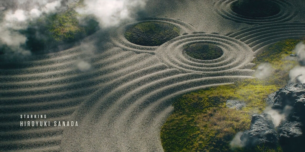
FX on Hulu’s historical drama series Shōgun is a captivating journey through Japan circa 1600, and needed a title sequence to match its transportive feel. Led by Creative Director Nadia Tzuo, the Elastic team worked with the show’s Executive Producer Justin Marks to create an unforgettable sequence that perfectly captures the spirit of the show within the setting of a zen garden. We chatted with Nadia about how Elastic created such expansive effects, which effect presented the biggest creative challenge, and what kinds of symbolism they were able to weave into the sequence.
Tell us about your approach to creating this spot. How did you decide on the creative direction?
We did a lot of research around Japan in the 1600s, the era when the show takes place. We looked into the art, the culture, and the overall style of the time. Among the directions we came up with, there was one all about a zen garden, which Justin told us immediately felt like the right way to go. I believe the choice was not only based on the look but also on the extra layer of philosophical meaning that connects with the story. Angus Wall called this direction “the walled garden,” which fits perfectly with Japan at that time with its isolation from the western world.

Tell us more about the meaning of the zen garden.
A zen garden is also not the type of garden you would walk in — it's meant to be observed and appreciated from a distance, each rock in the zen garden is purposefully placed with intention. I think that captures the point of view of the show’s protagonist, John Blackthorne, an observer of the Japanese political landscape. As viewers, we are immersed in this unfamiliar landscape like he is, and we’re learning about it as different points of view are revealed to us. Visually we start the sequence as the sun rises, with light shifting across the foliage, rocks, and sand. By the end, we pull out to reveal that the garden is actually Japan, the “walled garden.” By observing the garden from different angles, you’re shifting your point of view.
The gradual change in perspective also provides the viewer with an opportunity to look more closely at the garden from unusual angles, with symbols that represent entities that are central to the plot of the show.
How did you achieve the effects we see in the sequence?
This project was all done in Cinema 4D, with the RealFlow plugin. The team has gained some valuable experience around creating fluidity with it, which came in especially handy when working on the sand. The gravelly sand has a different weight and moves a little differently than generic beach sand.
We have the Dutch galleon sailing through the sands of the garden, just like the lead character guiding us through the story. That was the actual Erasmus that we were able to use as our guide. We were fortunate that the production team was so generous in providing all the help we needed, including models and photographic references, to make the assets accurate to the show.

Watching the title, you can spot a handful of symbols in the sand. What were some of those symbols that you worked in and why are they important?
We wanted to incorporate symbols that represent characters, like the family crest of Toranaga and a cross for Lady Mariko. The fragility of the sand represents lives in an age of turmoil and fleeting power in the show — watching the sand blow away reminds us as viewers that everything could be gone in minutes. We also decided not to have any figures in the landscape because we found that it would easily destroy the intentionally abstracted sense of scale, so the symbols are our way of representing the characters.
What was the most challenging part of this process, and what part are you most proud of?
I think everyone in our team would agree that the most challenging part was the sand. We were pleased with how it turned out. We also paid special attention to details like the texture of the rocks or the types of trees and mountains — if something was off, it could easily begin not looking like Japan anymore, and we really wanted to stay true to that look. I’m proud that we were able to get that final look with a streamlined process.
Watch the title sequence for Shōgun below.
