Making The Title: The Last Of Us

After its anticipated release, HBO’s The Last Of Us has cemented its place as a fan favorite — and so has the show’s now iconic title sequence. Striking a balance between the organic with the fantastic on this project was no small feat, but the Elastic team was up for the challenge. So what does it take to make a title as unique as this? We spoke with the Elastic creatives behind the title about their experience creating this one-of-a-kind sequence, and about exactly how they got it all done.
Tell us about your approach to the project.
Andy Hall, Creative Director:
Having a longstanding relationship with both HBO and the creators of The Last of Us, Craig Mazin and Carolyn Strauss, we were approached early on in the production process to explore potential visual approaches for the titles. Given the game's immense popularity and broad appeal, we aimed to create an iconic yet accessible title that would resonate with both diehard fans and casual viewers unfamiliar with the source material.
Initially, we presented a collection of ideas through references and loglines to Craig and Neil Druckmann, the game's creator, to kick off the conversation. This collaborative exploration led us to focus on the idea of a living organism as a metaphor for the decline of humanity as it evolves, which served as the catalyst for the creation of the main title.
Nadia Tzuo, Creative Director:
Our creative team was fortunate to start our collaboration with show creators Craig Mazin, Neil Druckmann, and Executive Producer Carolyn Strauss in mid-2021. Many of our team members are fans of the game, and our pre-existing understanding of it gave us a great foundation for setting the tone and messages of the story — most of our ideas came naturally. It was great to collaborate with Creative Director Andy Hall on this project. We also had valuable creative input from Jennifer Sofio-Hall, Paul Makowski, and Kate Berry.
We started by researching fungus. I was really inspired by lab imagery of fungal networks, especially how they resembled the modern traffic system and satellite images of city lights at night. It was interesting to me that different species behave in the same manner, with the unified goal to survive, communicate, and expand. We started to discuss building images from fungus and how we could incorporate that into an Americana theme. The process of storyboarding took several months before we brought in the production team. We spent a lot of time testing out different looks and carefully fitting all the ideas into one big picture. Editor Rachel Fowler was a great help in building the flow and timing out all the pieces.
Gryun Kim, Lead Animator:
I was immediately struck by the creativity and ingenuity of this project, which demanded high levels of technical expertise to bring to life. To make the project stand out, I set out to develop new solutions that audiences had not seen before. My goal was to bring something fresh and exciting to the project while also ensuring that the technical aspects of the animation were top-notch.
How did you execute these effects?
Nadia: Mike Zeng, Min Shi, and I created all the 3D scenes in C4D with the help of Mike Dupree, Jun Kim, Miguel Salek, Jade Smrz, and Alice Panek. When it comes to cinematic projects, we always benefit from the help from our CG department, as well as advice from Creative Director Kirk Shintani and Head of 3D Andy Wilkoff. On the technical side, we owe a huge thanks to our engineering team, Hannah Rowswell on the production side, and Andrew Young for the support with rendering and color management for the ACES pipeline. We modeled the fungus in Zbrush, taking references from nature, and tested a rigged animation approach with Derek Friesenborg, Jonah Austin, and Joshua Delaney. We eventually decided to use a combination of rigged models with C4D effectors to capture our effects, including animated fungus and vegetation growth, which were done by Gryun Kim and Lee Buckley.
Min Shi, Animator: As far as tools and software, we used Zbrush, Substance Painter, Cinema4D, and Octane Render to help realize our vision.

What challenges did you face on this project and how did you overcome them?
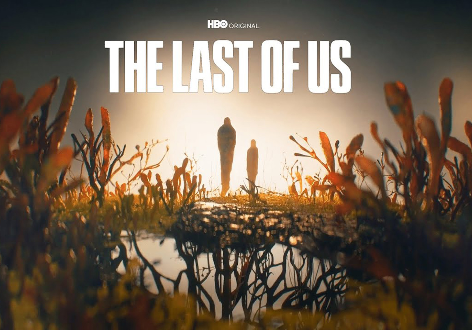
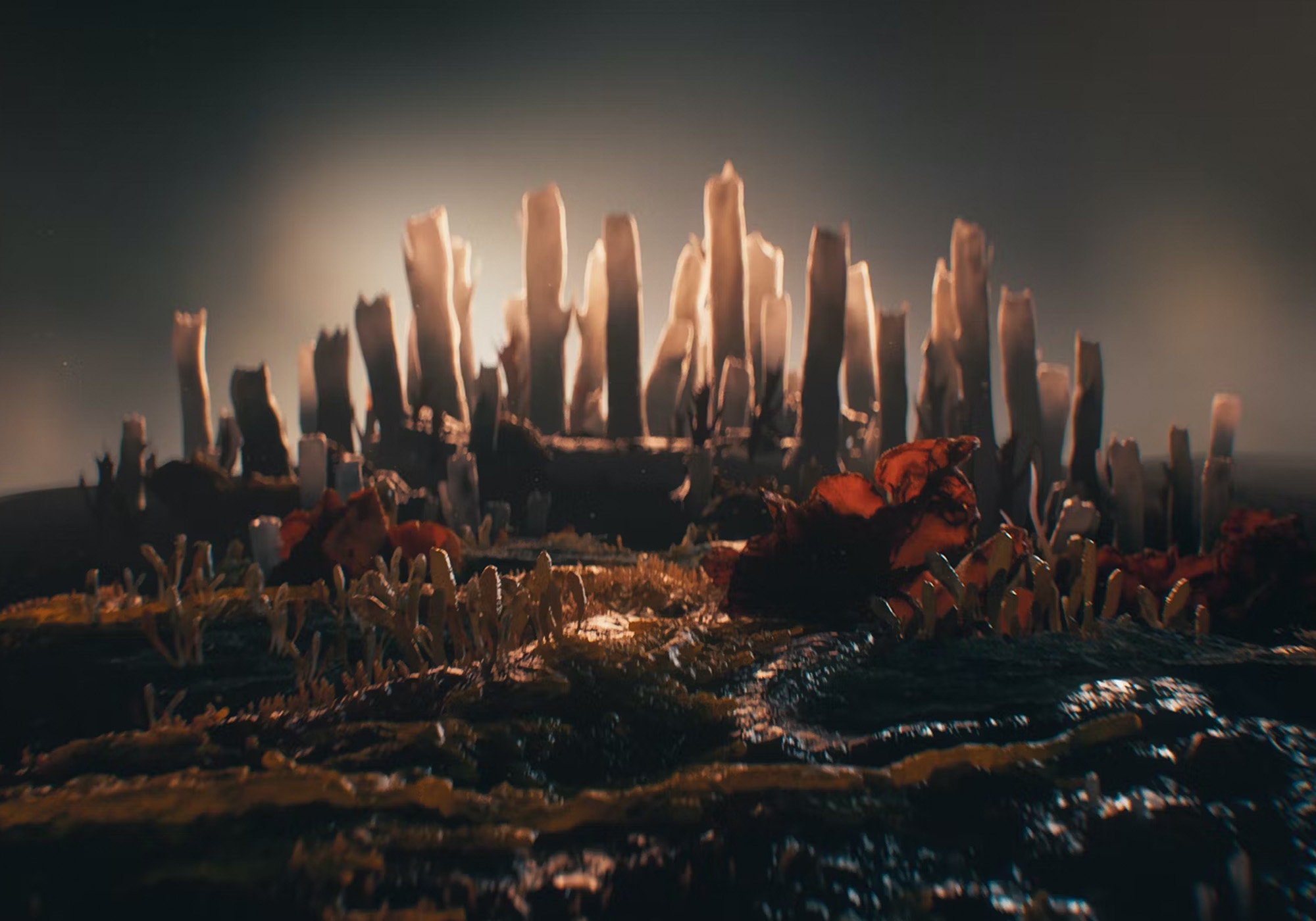
Nadia: We started from storyboarding, discussing ideas with Craig and Neil about how we would have the fungus form iconic compositions such as the freeway, the city, and most importantly the silhouette of Joel and Ellie. After we felt good about our compositions and framing, it was a challenge to weave a seamless camera movement throughout the scenes while the order of the narrative still evolves with the edit. We were blessed to have an amazing team to turn the storyboard frames into beautifully stylized environments. We were able to shift the 3D layout efficiently in a modular manner by keeping the 3D scenes organized.
Gryun: The original idea for the project involved a lot of cuts, but the team ultimately decided to create a one-take camera animation for the title sequence. I believed this approach would make the viewers feel as though they were a part of Joel and Ellie's journey, so I worked to adjust the speed of the fungus animation to create a sense of urgency. To further enhance the viewer's experience, we animated all the elements of the scene to increase the fear of the spreading virus. This included careful attention to the details of the fungus animation, as well as the timing of each shot to create a cohesive and engaging sequence.
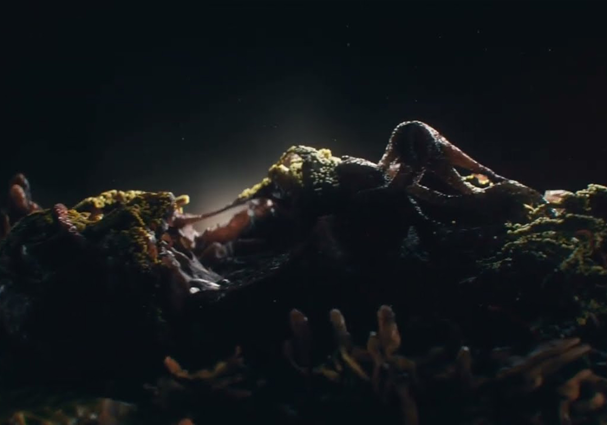
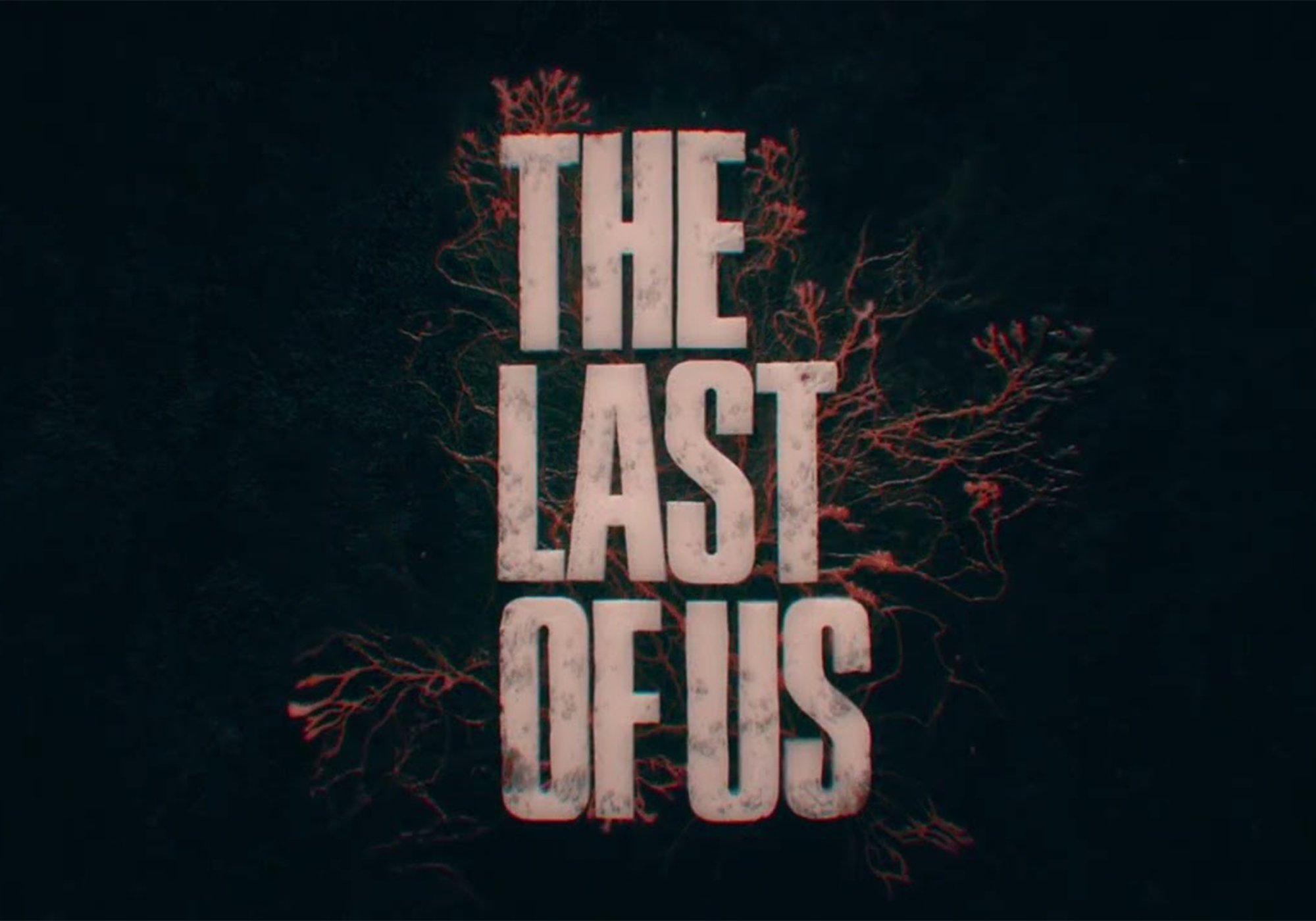
Nadia: We also worked hard to find the best animation techniques to achieve specific fungus growth, which was definitely a challenge. As soon as we started the project, we went through an R+D process with different animation approaches. Eventually, we were able to create the look with a combination of animated texture and Houdini simulation, which was developed by Gryun Kim and Jun Kim. I was also able to utilize the same technique when designing and animating the logo.
Gryun: That realistic fungus-spreading simulation had to be completed in a short amount of time, so to achieve this, I decided to combine real footage of fungus with CG-generated animation. By blending these two elements, I was able to create a scene that looked both real and unreal, ultimately helping to enhance the overall experience for viewers. My goal was to create a sense of chaos and unease that would draw the audience into the world of the show and make them feel as though they are a part of the experience, and that they are witnessing something truly unique and exciting.
Mike Zeng, Designer: The main challenge for me was creating realistic and believable organic textures. I try to use only textures to create the slime mold structure.
Min: It was definitely challenging to find the balance between nature versus manmade, organic versus rigid, flow versus conflict, and most importantly, abstract versus literal. Andy and Nadia gave me plenty of freedom to explore such an epic concept through this macro fungal world, but they always guided me back in the right direction when I went too literal. For example, in the beginning, when I was designing the ending shot, I incorporated too much anatomical detail in an attempt to make sure viewers could tell that the two fungal figures are Joel and Ellie — so much so it actually lost the beauty of the metaphor. As an artist, it’s hard to find the balance between showing off technique and keeping the concept strong, but Andy and Nadia were invaluable in helping me see the bigger picture.
What about this project was most inspiring or unique to you?
Mike: I think the way that the title combined fungus with the landscape and characters was a smart and artistic way to interpret the background of the show. Technically, achieving a one-shot sequence with great animation and simulations requires a lot of tests and advanced techniques to put together, and it’s rare to see a sequence doing that these days, so that was inspiring to see pulled off.
Min: It was a really unique challenge for me to imagine and design city skylines and freeways made of fungus, barbed wire made of fungus, and even Joel and Ellie made of fungus. I had to ask myself a lot of theoretical questions: how big is a city skyline? How small are the details on fungus? How can those two things appear in the same shot cohesively? It's a hard thing to make appear convincing and read clearly to the viewer. After many rounds of design and going through tons of references provided by the original video game concept artists, I'm so proud that our team has made this microscopic world so convincing and immersive.

What are you most proud of about this project?
Nadia: We are fortunate that all our team members are extremely talented and experienced when it comes to visual development for title sequences. This was one of those rare projects where we were given time and freedom for concept development conversations, and it was a joy to brainstorm and take the time to polish the design and animation.
Min: Designing this type of organic material is already super challenging, not to mention animating it. I really respect our animation team for the massive effort it took to bring that effect to life.
Mike: The team did a great job getting multiple complex scenes into one shot and making the simulations look insanely realistic. I’m happy to have been a part of this project and contribute to the lighting and texturing of it.
Gryun: As we approached the final stages of the project, we took great care to meticulously review every frame to ensure that everything was as it should be. This level of attention to detail was only possible because of the strong teamwork and shared commitment to excellence that we had as a group.
What has it been like to watch the audience's reaction to the title?
Steve Biggert, Animator: To me, the most interesting reactions to the main title have been from those in our industry, particularly the Youtube tutorials on how other artists learning the trade could achieve a similar effect. It shows that the title is not only unskippable to the regular viewer but also that it sparks intrigue and inspiration to members of the design community.
Gryun: We really set out to appeal to both the fans of the original game as well as to new viewers. It was important to strike a balance that would capture the essence of the game while still feeling fresh and exciting. When I see the reaction videos on YouTube and witness the overwhelmingly positive response to our title sequence, it fills me with pride and happiness. It's clear that our team succeeded in creating something special that resonated with fans of the game and newcomers alike.
Min: As soon as the show premiered, I went to check the audience's reactions on Youtube. Seeing how others interpret the sequence is one of my favorite parts, some of the comments from the viewers are truly inspiring. I feel very happy that audiences find the title sequence very immersive — it makes me like what I do as my career even more.
Watch the title sequence for The Last Of Us below.
CREDITS:
Design Studio: Elastic
Creative Director: Andy Hall & Nadia Tzuo
Designers: Mike Zeng, Min Shi
3D Animation & Compositing: Gryun Kim, Lee Buckley
2D Animation: Lucy Kim, Steve Biggert
Dynamics: Jun Kim, Miguel Salek
CG Animation: Derek Friesenborg, Jonah Austin, Joshua Delaney
Modeler: Mike Dupree
Rigging: Jade Smrz, Alice Panek
Editor: Rachel Fowler
Color Management: Andrew Young
Production Coordinator: Hannah Rowswell
Head of CG: Kirk Shintani, Andy Wilkoff
Senior Producer/Head of Production: Paul Makowski
Executive Producer: Kate Berry
Managing Director: Jennifer Sofio Hall
